A logo may look perfect in its original format, but a website rarely uses it in only one place. The same design must work in a wide desktop header, a compact mobile menu, a dark footer, a browser tab and sometimes over photographs or coloured backgrounds.
That is why a professional brand normally needs a small logo system, rather than a single image file. The goal is not to create several unrelated logos. Each version should remain recognisable as the same brand while adapting to a different space or background.
The Essential Logo Versions for a Website
1. Primary Logo
The primary logo is the complete version of the brand mark. It usually combines:
- the brand name;
- a symbol or icon;
- an optional tagline.
This is the version used in prominent areas such as the homepage, brand presentations and large website sections.
However, the primary logo is not always suitable for the website header. A tall or square logo may require too much vertical space, while a detailed tagline may become unreadable at smaller sizes.
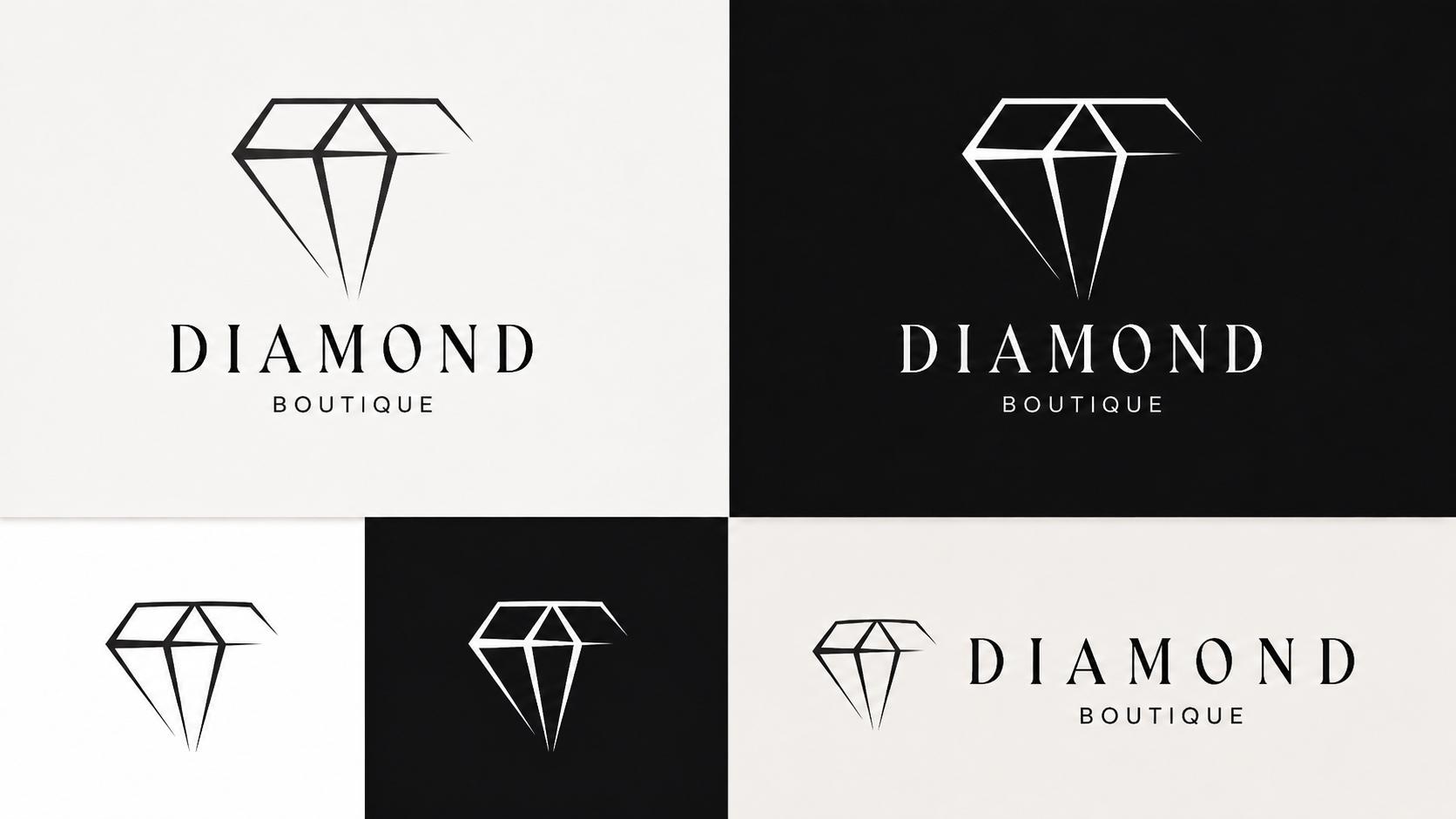
2. Horizontal Logo
A horizontal version places the symbol beside the brand name rather than above it.
This format is particularly useful for:
- desktop website headers;
- navigation bars;
- email signatures;
- document headers;
- narrow banners.
A horizontal logo helps keep the website header compact while leaving enough room for the navigation menu and call-to-action buttons.
Even when the primary logo is square, creating a horizontal alternative is often worthwhile.
3. Stacked or Square Logo
A stacked logo normally places the symbol above the brand name. It works well where the available width is limited but enough vertical space is available.
Common uses include:
- social media profile images;
- promotional graphics;
- website sections;
- packaging;
- printed materials.
When the original logo is already square, it can serve as the stacked version without requiring a separate design.
4. Symbol-Only Version
The symbol-only version removes the brand name and keeps the most recognisable visual element.
It can be used for:
- mobile navigation;
- social media avatars;
- app icons;
- small website elements;
- watermarks;
- branded patterns.
The symbol should still be recognisable without the accompanying text. If removing the name makes the design unclear, the icon may need to be simplified or developed further.
5. Favicon
A favicon is the small icon displayed in the browser tab, bookmarks and some search interfaces.
Because favicons appear at very small sizes, the full logo is rarely suitable. Fine lines, taglines and detailed lettering may disappear completely.
A favicon should normally use:
- a simple symbol;
- a single letter or monogram;
- a bold and recognisable shape;
- strong contrast.
The design must remain clear even at approximately 16 × 16 or 32 × 32 pixels.
Light and Dark Logo Versions
Every important logo variation should work on both light and dark backgrounds.
A practical logo package usually includes:
- a full-colour version;
- a dark or black version;
- a white version;
- a single-colour version.
For example, a black logo may look elegant on a white website but disappear entirely in a dark footer. A white alternative allows the same identity to remain visible without adding an artificial white box around it.
Whenever possible, logo files should have a transparent background. A fixed white rectangle around the logo can make it look unfinished when placed on another colour.
How to Choose Good Logo Colours
Colour should support the personality of the brand rather than being selected only because it looks attractive.
Different combinations can create very different impressions:
- Black and white can feel timeless, elegant and premium.
- Blue is often associated with professionalism, technology and reliability.
- Green can suggest nature, health, sustainability or growth.
- Red creates energy and urgency but can easily dominate the design.
- Purple may feel creative, luxurious or distinctive.
- Neutral beige and brown tones can create a warm, natural or handcrafted appearance.
These associations are not strict rules. Context, typography, imagery and the target audience matter just as much as the colour itself.
Keep the Palette Focused
A logo usually does not need many colours. One primary colour, one supporting colour and one neutral are often enough to create a flexible identity.
Too many competing colours can:
- reduce readability;
- make the design harder to reproduce;
- create inconsistency across the website;
- make the logo look busy at smaller sizes.
Before approving the palette, test the logo:
- in full colour;
- in black and white;
- on a light background;
- on a dark background;
- at a very small size.
A strong logo should remain understandable even without colour.
Contrast and Readability
Good contrast is essential, especially online.
A light grey logo may look refined on a designer’s screen but become nearly invisible on a white website. Similarly, bright colours can lose definition when placed over photographs or gradients.
Avoid placing the logo directly over a busy image unless there is enough separation. Possible solutions include:
- using the white logo version;
- adding a subtle dark overlay to the photograph;
- positioning the logo in a quieter part of the image;
- placing it on a simple background area.
The logo should never require effort to identify.
Choosing the Right Typography
The typeface in a logo influences how the entire brand feels.
A serif font can appear traditional, editorial or luxurious. A sans-serif font may feel modern, clean or approachable. Display fonts can add personality, but highly decorative lettering may be difficult to read.
A good logo typeface should:
- remain readable at different sizes;
- fit the character of the business;
- avoid unnecessary visual effects;
- work beside the chosen symbol;
- remain distinctive without becoming impractical.
Letter spacing also matters. Widely spaced letters can create an elegant appearance, but too much spacing may weaken readability. Very tight lettering can feel crowded, especially on mobile screens.
Simplicity Matters
A logo does not need to explain every service the business offers.
Adding too many symbols, details or ideas can make the design difficult to recognise and almost impossible to use at small sizes. A simpler mark is generally easier to:
- remember;
- resize;
- reproduce;
- animate;
- print;
- use consistently.
This does not mean every logo must be minimal. It means every element should have a purpose.
Make Sure the Logo Fits the Business
The visual style should match both the company and its audience.
A luxury boutique may benefit from refined typography, generous spacing and a restrained colour palette. A children’s brand may use softer shapes and brighter colours. A technology company may choose geometric forms and a clean sans-serif typeface.
The logo should also reflect the brand’s actual positioning. A highly luxurious identity may feel misleading for a budget-focused service, while an overly casual logo may reduce trust in a professional or financial business.
Test the Logo in Real Website Situations
Do not approve a logo only by viewing it alone on a blank page.
Place it inside realistic mockups:
- desktop header;
- mobile header;
- dark footer;
- contact page;
- social profile;
- browser tab;
- marketing graphic.
This reveals practical problems that may not be obvious in the original design. The text may be too thin, the symbol may disappear, or the entire logo may make the header unnecessarily tall.
A logo must not only look good—it must work.
Recommended File Formats
For websites, the most useful file formats are:
SVG
SVG is usually the preferred format for website logos because it remains sharp at any size and normally has a small file size.
It is ideal for:
- headers;
- footers;
- responsive layouts;
- high-resolution displays.
PNG
PNG is useful as a backup format and supports transparent backgrounds. It should be exported at a sufficiently large resolution to avoid appearing blurry.
JPG
JPG is generally not recommended for logos because it does not support transparency and can introduce visible compression around text and sharp lines.
It may be acceptable for a logo placed permanently on a specific photographic background, but it should not be the main logo file.
A Practical Website Logo Package
A complete but manageable logo package should include:
- primary logo;
- horizontal logo;
- stacked or square logo;
- symbol-only version;
- favicon;
- full-colour version;
- dark version;
- white version;
- SVG files;
- transparent PNG files.
Not every brand needs dozens of variations. The objective is to prepare enough versions to cover the most common situations without losing consistency.
Common Logo Mistakes
Some of the most frequent problems include:
- using only one logo file everywhere;
- placing a black logo on a dark background;
- keeping a white box around the logo;
- including a tagline that becomes unreadable;
- using the full logo as a tiny favicon;
- choosing colours with poor contrast;
- creating a logo that only works at a large size;
- using overly thin lines that disappear on mobile;
- changing the proportions when resizing;
- using low-resolution image files.
The logo should always be resized proportionally. Stretching it horizontally or vertically can immediately make an otherwise professional website look careless.